Introduction to Color Psychology
Understanding the Basics: What is Color Psychology?
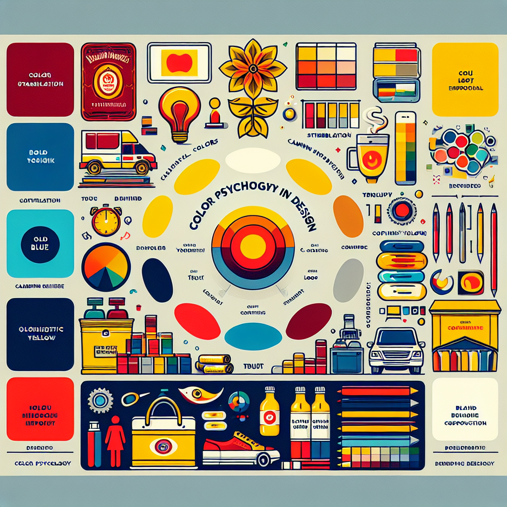
Color psychology is the study of how hues influence human behavior and perception. It delves into the emotional and psychological effects that different colors have on individuals. By understanding these effects, designers and marketers can make informed choices about the colors they use in their projects, whether for branding, advertising, or product design.
The Role of Color in Human Emotion and Perception
Colors wield a profound impact on our emotions and perceptions. They can evoke specific feelings, such as calmness, excitement, or trust. For instance, blue often instills a sense of calm, whereas red can stimulate excitement and urgency. Recognizing these emotional triggers is essential for creating designs that resonate with the intended audience.
The Science Behind Colors
The Impact of Colors on Mood and Behavior
The relationship between colors and mood is well-documented. Warm colors like red, orange, and yellow can energize and invigorate, while cool colors such as blue, green, and purple tend to soothe and relax. This psychological response can be harnessed effectively in various industries, from retail to healthcare.
Cultural Influences on Color Interpretation
Cultural context plays a significant role in how colors are perceived. For example, while white symbolizes purity and peace in Western cultures, it is associated with mourning in some Eastern cultures. Designers must consider these cultural variances to avoid miscommunication and ensure their message is universally understood.
The Brain’s Response to Different Colors
The human brain processes colors in multifaceted ways. When we see colors, the brain releases different chemicals that can influence our mood and reactions. Studies using neuroimaging techniques reveal that color processing involves areas of the brain associated with both visual recognition and emotional regulation.
Key Principles of Color Theory in Design
The Color Wheel: Primary, Secondary, and Tertiary Colors
The color wheel is a fundamental tool for understanding color relationships. It consists of primary colors (red, blue, yellow), secondary colors (green, orange, purple), and tertiary colors formed by mixing primary and secondary hues. This tool helps designers create balanced and visually appealing color schemes.
Warm vs. Cool Colors: Creating Ambiance and Atmosphere
Warm colors, ranging from red to yellow, are known for their ability to create a lively and cozy atmosphere. Conversely, cool colors, from blue to green, evoke tranquility and openness. Effective use of these tones can significantly influence the ambiance of a space or a design.
Complementary and Analogous Colors: Harmonizing Design
Complementary colors are opposite each other on the color wheel and provide high contrast, making them perfect for creating vibrant and dynamic designs. Analogous colors, which are next to each other on the wheel, offer harmonious and cohesive palettes, ideal for more subtle and sophisticated designs.
Implementing Color Psychology in Branding
The Importance of Branding Colors: Building Recognition and Trust
Branding colors are vital in establishing a company’s identity and eliciting emotional responses from consumers. Consistent use of specific colors can build brand recognition and foster trust. It’s no coincidence that many financial institutions use blue to convey reliability and safety.
Analyzing Successful Brand Color Palettes
Examining the color strategies of successful brands reveals common themes in color selection. Companies like Coca-Cola (red) and Facebook (blue) choose colors that align with their brand messaging and target audience’s emotional responses. Analyzing these palettes provides valuable insights for developing effective branding.
Case Studies: Brands That Mastered Color in Their Identity
Brands like Apple, McDonald’s, and Nike have mastered the use of color in their branding. Apple’s minimalist approach with neutral tones exudes sophistication and innovation. McDonald’s iconic red and yellow evoke excitement and happiness, while Nike’s black embodies power and elegance. These case studies illustrate the strategic application of color psychology in branding.
Color in User Experience and Interface Design
Color Accessibility: Designing for All Users
Accessibility in design ensures that all users, including those with visual impairments, can engage with the content effectively. Utilizing high contrast and considering color blindness when choosing design colors can enhance usability and inclusivity.
The Psychology of Action Colors: Calls to Action and Navigation
Colors play a pivotal role in user interface design, especially for calls to action (CTA) and navigation elements. Action colors like red, orange, and green are often used for buttons and links, as they draw attention and encourage interaction. Understanding this psychological trigger can improve user engagement and conversion rates.
Testing Color Choices: A/B Testing and User Feedback
A/B testing helps designers determine the most effective color choices by comparing different versions of a design and collecting user feedback. This data-driven approach ensures that color decisions are backed by real user preferences, optimizing the overall user experience.
Conclusion
Summarizing the Impact of Color in Design
In conclusion, color psychology is an indispensable element in design, influencing emotions, behaviors, and perceptions. Understanding the science and principles behind colors allows designers to create more impactful and meaningful work.
Future Trends: Evolving Perspectives on Color Psychology
As design trends evolve, so does the application of color psychology. Future innovations may include more personalized color experiences and adaptive design colors that change based on user preferences and environments.
Encouraging Thoughtful Color Choices in Design Practice
Designers are encouraged to make thoughtful color choices, considering their audience’s psychological and cultural context. By leveraging the power of color psychology, they can create more compelling and effective designs that resonate deeply with users.