“`html
Selecting the Perfect Typography for Your Brand
Understanding Typography: The Backbone of Design
Definition of Typography in Graphic Design
Typography is not simply an art form; it is the craft of arranging type to make written language legible, readable, and appealing when displayed. In graphic design, typography extends beyond mere aesthetics; it’s an integral component that structures information and directs visual attention.
The Emotional Impact of Fonts: How Typography Influences Perception
Fonts carry emotional weight. The right choice of typography can evoke emotions and convey messages subtly yet powerfully. Consider how a bold, angular font can communicate strength, whereas a delicate, cursive font may evoke elegance and intimacy.
Key Typography Terminology: Baseline, Leading, Kerning, and More
Understanding typography involves familiarizing oneself with terminology such as baseline (the line upon which most letters sit), leading (the vertical spacing between lines), and kerning (adjusting the spacing between characters). Mastery of these terms is crucial for effective design.
The Role of Typography in Branding
The Power of Font Selection: More Than Just Aesthetic Appeal
Font selection is pivotal to brand identity. It’s more than visual appeal; it’s a strategic tool that influences how audiences perceive and connect with a brand. Selecting the right typeface can significantly enhance a brand’s memorability.
How Typography Communicates Brand Values and Personality
Typography serves as a visual voice of a brand. It conveys brand values and personality through its style and structure. A modern, sans-serif font may represent innovation, whereas a serif font may suggest tradition and reliability.
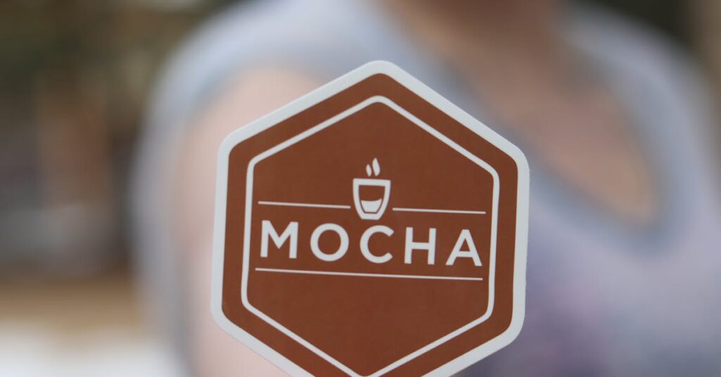
Case Studies: Brands That Made Typography Their Signature
Some brands have transcended traditional design norms by making typography their signature element. Consider Coca-Cola’s iconic logo or Apple’s minimalist approach. Each of these examples illustrates how typography can become synonymous with a brand identity.
Choosing the Right Fonts for Your Brand Identity
Identifying Your Brand’s Personality: Playful, Sophisticated, or Minimal?
Brand personality is the compass in font selection. Your audience should perceive your brand exactly as envisioned. Whether playful and innovative or sophisticated and timeless, font choices should resonate with the brand’s core identity.
The Importance of Versatility: Selecting Fonts for Various Platforms
In the digital age, versatility is key. Fonts must function seamlessly across platforms—from print to web—and devices, ensuring that brand consistency remains intact regardless of where the brand encounters its audience.
Combining Fonts: How to Create Harmony Between Different Typefaces
Combining fonts requires a delicate balance. Effective font pairings create visual harmony and can elevate brand messaging. Experiment with typeface combinations to achieve a cohesive look that complements the overall brand aesthetic.
Best Practices in Font Selection
Readability and Accessibility: Why They Should Be Prioritized
Readability and accessibility are imperative. Typography should transcend aesthetic alone; it should facilitate understanding and inclusivity, ensuring that text is legible to all viewers, including those with visual impairments.
The Impact of Hierarchy: Using Typography to Guide the Viewer
Typography can guide the audience’s journey through content. By establishing a hierarchy, designers can direct attention to key messages, creating a smooth transition from one element to the next through visual cues.
Creative Constraints: Working Within Brand Guidelines
Brand guidelines serve as creative constraints that ensure consistency and coherence. While experimenting is welcome, adhering to guidelines ensures that typography aligns with the brand’s values and identities across all communication channels.
Testing and Implementing Your Typography Choices
Conducting Typography Tests: Gathering Feedback and Making Adjustments
Typography testing is a crucial step. Gathering feedback from target audiences can provide insightful perspectives that aid in refining font choices, ensuring they align with brand objectives and viewer expectations.
The Importance of Consistency Across All Branding Materials
Consistency is key in branding. Ensuring uniformity in typography across all materials enhances recognizability and reinforces brand identity, fostering a strong connection between the brand and its audience.
Revamping Your Brand: When and How to Refresh Your Typography
Refreshing your brand’s typography can be rejuvenating. Brands should assess evolving trends and audience preferences to ensure that their typography remains contemporary, relevant, and reflective of their evolving identity.
Conclusion: Bringing Your Brand to Life Through Thoughtful Typography
In conclusion, typography is the unsung hero of branding, breathing life into words through design. Selecting the right typography is paramount in creating an indelible brand impression. Brands must stay open to experimenting and evolving with their typography choices as they cultivate a strong and lasting brand identity.
“`