Choosing the Right Color Scheme for Your Brand
Understanding the Psychology of Color in Branding
The Emotional Impact of Colors on Consumer Behavior
Colors evoke specific emotions and reactions in consumers, influencing their purchasing decisions. A bright red can generate a sense of urgency, while a cool blue may create a calming effect. Understanding these emotional triggers can help you craft a compelling and influential brand identity.
The Role of Color in Brand Recognition
Consistency in color use amplifies brand recognition. Think of the iconic red of Coca-Cola or the blue of Facebook. These colors become instantly identifiable, reinforcing the brand’s presence and making your brand memorable among a sea of competitors.
Cultural Associations and Color Perception
Cultural context often influences how colors are perceived. In Western cultures, white symbolizes purity, while in some Eastern cultures, it signifies mourning. Knowledge of these perceptions ensures your brand colors communicate the intended message across different cultural contexts.
Identifying Your Brand Personality
Defining Your Brand Values and Message
A clear understanding of your brand values and message is foundational. Are you a cutting-edge tech company or a heritage fashion brand? Your values and message should drive your color choices, influencing how consumers perceive and connect with your brand.
Aligning Color Choices with Brand Personality Traits
Colors should reflect the essence of your brand personality. An eco-friendly brand might lean towards greens and earthy tones, while a luxury brand might opt for black and gold. Ensuring alignment between color and personality fosters a cohesive and authentic brand portrayal.
Case Studies: Successful Brands and Their Personality-Based Color Schemes
Reviewing successful brands can offer valuable insights. For instance, Apple’s minimalist use of neutral colors exudes simplicity and sophistication. Conversely, Nickelodeon’s vibrant orange captures creativity and fun, perfectly resonating with its youthful audience.
Choosing the Perfect Color Palette
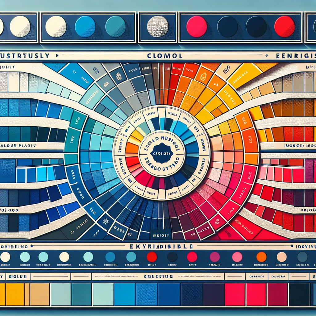
Color Wheel Fundamentals: Primary, Secondary, and Tertiary Colors
Understanding the basics of the color wheel is crucial in selecting an effective palette. Primary colors (red, blue, yellow) form the basis, combining to create secondary (orange, green, purple) and tertiary colors. This knowledge allows you to create harmonized and visually appealing color schemes.
Selecting Complementary, Analogous, and Triadic Color Schemes
Complementary colors sit opposite each other on the color wheel and provide high contrast. Analogous colors sit next to each other, offering a harmonious design. Triadic color schemes use three evenly spaced colors for vibrant and balanced combinations. Your choice will depend on the desired visual impact and brand message.
Tools and Resources for Creating Your Color Palette
Several tools facilitate the creation of a color palette. Websites like Adobe Color and Coolors provide intuitive platforms to explore and refine your color schemes, ensuring they meet your brand’s standards.
Design Tips for Implementing Your Brand Colors
Balancing Color in Digital and Print Designs
Balance is key in both digital and print designs. Overloading your designs with too many colors can be overwhelming. Instead, use a primary color for the main elements and secondary colors for accents, maintaining visual harmony.
Using Color Consistently Across Various Platforms
Consistency in color application strengthens brand identity. Ensure the same RGB or CMYK values are used across all digital and print materials. This uniformity reinforces your brand’s image, whether on a website, social media, or printed brochure.
Tips for Legibility and Accessibility in Design
Consider legibility and accessibility when choosing colors. Ensure sufficient contrast between text and background to maintain readability. Furthermore, test for color blindness compatibility, offering a more inclusive and user-friendly design.
Testing and Refining Your Color Scheme
The Importance of A/B Testing Different Color Options
A/B testing allows you to compare different color options to determine which resonates best with your audience. This data-driven approach can significantly enhance engagement and conversion rates, providing concrete evidence of your color scheme’s effectiveness.
Gathering Feedback from Your Audience
Direct feedback from your target audience is invaluable. Utilize surveys, focus groups, or social media polls to gather opinions on your color choices. This feedback ensures your colors align with consumer expectations and preferences.
Adapting to Trends While Staying True to Your Brand Colors
While it’s beneficial to stay aware of design trends, your brand’s core colors should remain consistent. Subtle tweaks and seasonal variations can keep your brand current without diluting its identity, balancing modernity with tradition.
You’ve the most impressive websites.
Thank you 🙌